Overview
Mail & Guardian faced a significant challenge with their Instagram posts, which were often perceived as too boring and less attractive to their audience. Their existing posts struggled to capture the attention of followers, resulting in lower engagement rates. This lack of visual appeal and engaging content was a barrier to effectively disseminating crucial information, especially during the COVID-19 pandemic when timely updates and clear communication were vital. The project aimed to address these issues by introducing innovative and visually captivating designs that could hold the audience's interest while conveying important data.
Duration:
3 weeks
My Role:
UX Research, User Experience, User Interface Design, and Visual Design
Tools Used:
Adobe Illustrator, Adobe Photoshop, Canva, Figma, Sketch
Design Elements
Rationale:
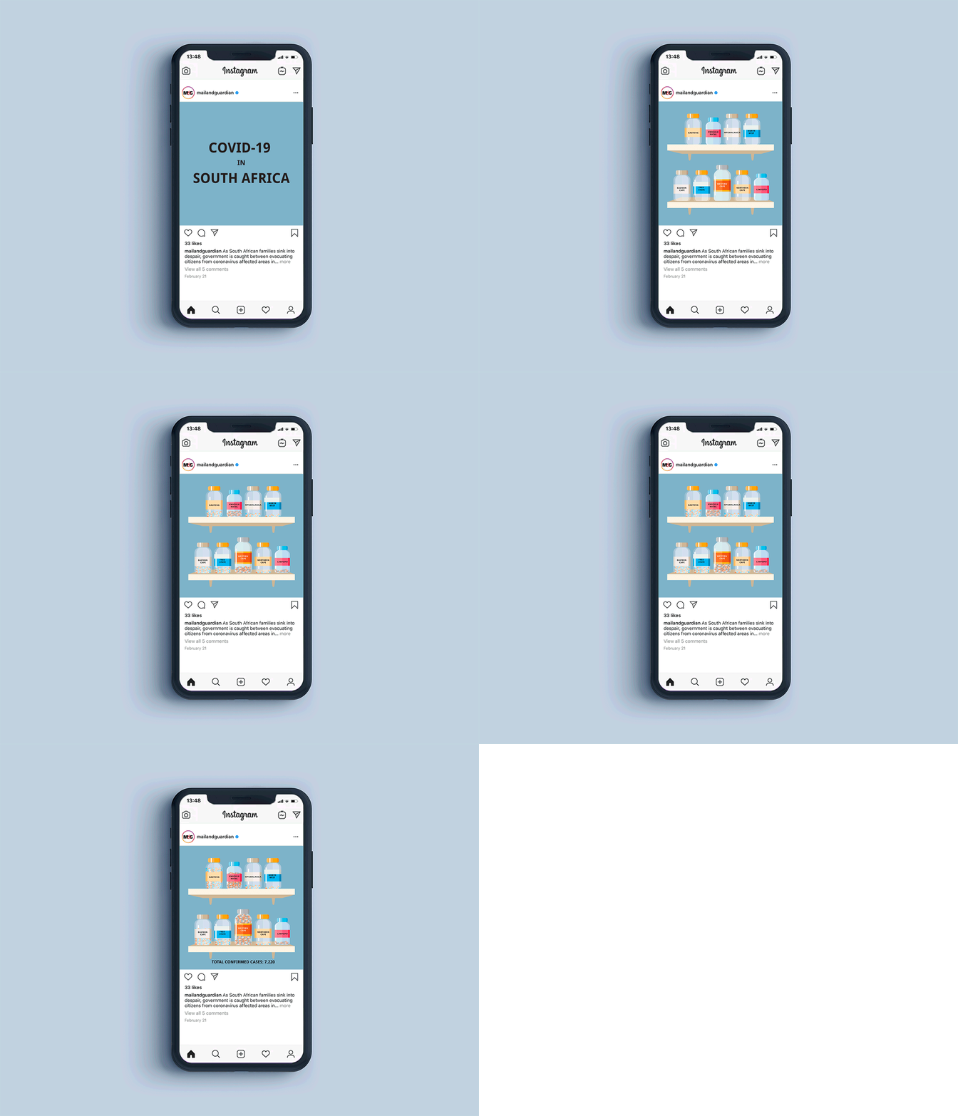
The use of medicine bottles and pills draws an immediate connection to the medical theme, making the data more relatable and easier to understand. This innovative approach helps to capture the audience’s attention and conveys the seriousness of the situation in a visually engaging manner.
Medical Bottles: Each bottle is labeled with the name of a South African province. The number of pills inside each bottle represents the number of confirmed COVID-19 cases in that province.
Shelves: Bottles are organized on two shelves, providing a clear and organized layout.
Total Confirmed Cases: A summary line at the bottom shows the total number of confirmed cases, making it easy to understand the overall situation at a glance.
Design Prototyping
