Overview
The Susan G. Komen Race for the Cure organization is a pillar in the fight against breast cancer, dedicating itself to research, care, community support, and advocacy. This noble foundation has been instrumental in advancing breast cancer awareness, treatment, and survival rates.
My journey toward understanding and supporting this cause was ignited when my aunt was diagnosed with breast cancer, which drove me to seek out resources and communities for support and information. I encountered Susan G. Komen's official app, a tool with immense potential to serve as a comprehensive platform for those affected by breast cancer, their families, and individuals seeking to educate themselves about the disease; however, I discovered that the app did not fully meet expectations.
Given the organization's significant role and the critical nature of its mission, it became clear that the app should be more than just a tool. This realization spurred my passion to redesign the Susan G. Komen app to enhance its features that truly reflect the foundation's mission and the needs of its community.
Duration:
4 weeks
My Role:
UX Research, User Experience, User Interface Design, and Visual Design
Tools Used:
Adobe Illustrator, Adobe Photoshop, Canva, Figma, Sketch
Research
Before diving into the redesign of the Susan G. Komen app, I took a step back to comprehensively understand the primary needs, challenges, and behaviors of its diverse user base. To accomplish this, I explored various platforms where discussions about breast cancer and community support occur, such as health forums, breast cancer support groups, and social media pages dedicated to wellness and survivor stories.
After reviewing research and statistics provided by the Susan G. Komen website, I realized that many individuals might not be aware of essential breast cancer facts. Therefore, I created an infographic using the statistics I gathered to help enhance understanding of the basics of breast cancer. Moreover, according to the National Breast Cancer Foundation, it is estimated that approximately 30% of all new female cancer diagnoses will be breast cancer in 2024. As a designer, I feel it's my responsibility to help raise awareness about breast cancer.
According to Susan G. Komen's report, the organization serves survivors, supporters, caregivers, researchers, volunteers, and both current and potential donors. Considering the diversity of users and the varied purposes of use, I determined that redesigning the app could significantly improve areas that directly affect user satisfaction and engagement.
Analysis of the Current App Usage

Login Process

Login Process
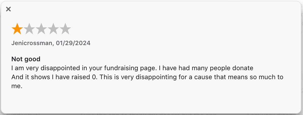
1. The app fails to provide a clear option for new user registration, by presenting only options for returning users or social media login. This design oversight can alienate potential users who are either uncomfortable with or unable to use social media credentials for login purposes.
2. Directing users to a poorly designed page for social login, where essential information is tucked away in a small box at the top of the screen, further exacerbates user frustration and diminishes the user experience right from the start.
3. The second interface's divergence from the primary design can erode user trust, as consistency in visual and functional design is key to user confidence, especially when dealing with personal information.
User's Account Interfaces
1. The interface does not appear to have a clear visual hierarchy. Important information such as fundraising progress and event participation is presented at the same visual weight as less critical information, which can make the screen look cluttered and overwhelm the user.
2. Key information and interactive elements are placed without adequate spacing, which causes difficulty in distinguishing between different sections and restricts the user's ability to find the information they need.
3. The navigation bar at the bottom of the screen blocks access to the app's key features. Users feel frustrated as it obstructs functionality and interaction, which makes it difficult for users to navigate the app effectively.


Problems
Login and Accessibility Issues
Users have difficulty accessing the app’s resources, community, and support systems for those affected by breast cancer.
Lack of Community Engagement Features
The app lacks engaging features that facilitate connection and communication among users to foster a supportive community for individuals affected by breast cancer and their families.
Inadequate Educational Content
Users seeking information about breast cancer find the app's educational content insufficient which limits the app's potential as a comprehensive resource for learning and awareness.
Event Integration and Visibility
The app fails to effectively promote and integrate Race for the Cure events of the Susan G. Komen Foundation.
Inefficient Donation Process
The app’s current design complicates the donation process and deters potential donors to fund research, care, and advocacy efforts in the fight against breast cancer.
Mind Mapping
User Persona
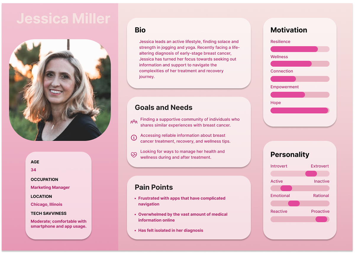
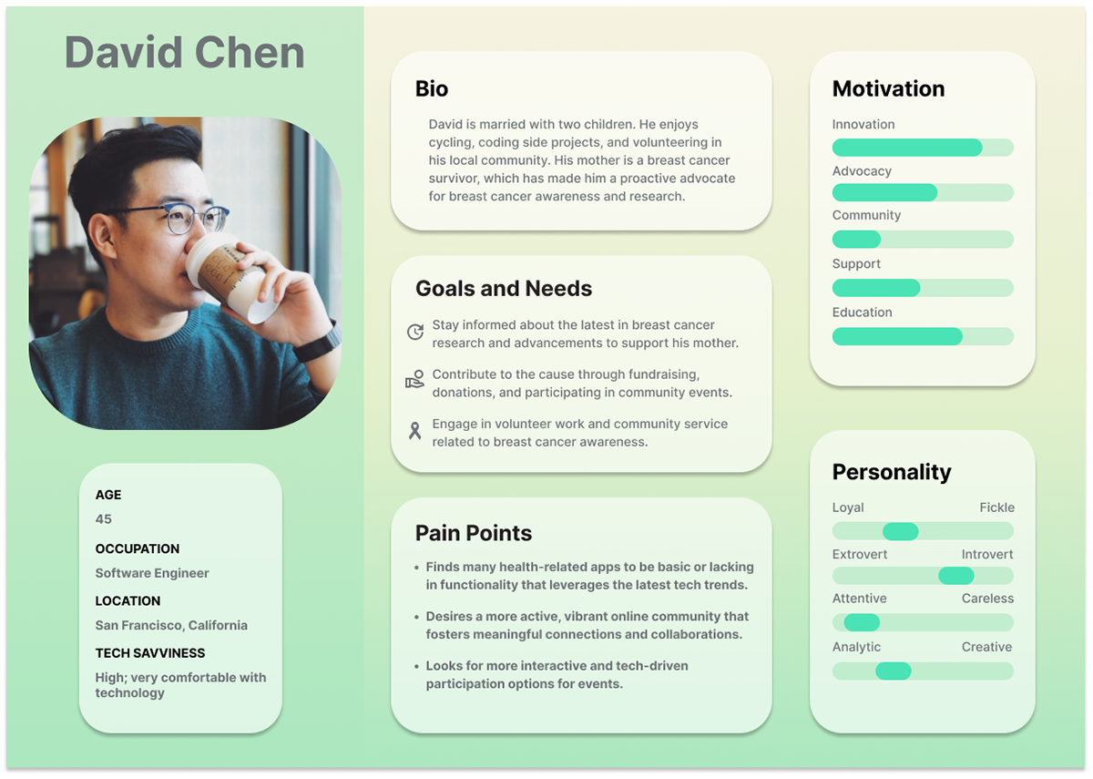
To capture a broader range of user needs, behaviors, and goals, I created two personas —Jessica and David—that represent distinct segments of the app’s user base with different backgrounds, motivations, and pain points.
Targeted Feature Development
Different personas highlight varying needs for app features. While Jessica may value a strong support community and clear educational content, David might prioritize innovative features and the ability to make an impact through technology.
Comprehensive Testing
With multiple personas, I can test the app's design against a range of user scenarios and ensure it performs well across different use cases, enhancing the overall user experience.
Accessibility and Usability
Designing for different personas ensures that the app is accessible and usable by people with varying levels of tech literacy and physical abilities, reflecting real-world diversity.
Avoiding Design Bias
Relying on a single persona might lead to a narrow design focus, potentially overlooking the needs of other users. Multiple personas guard against designing based on assumptions or stereotypes.
User Interface
Optimized Login Process
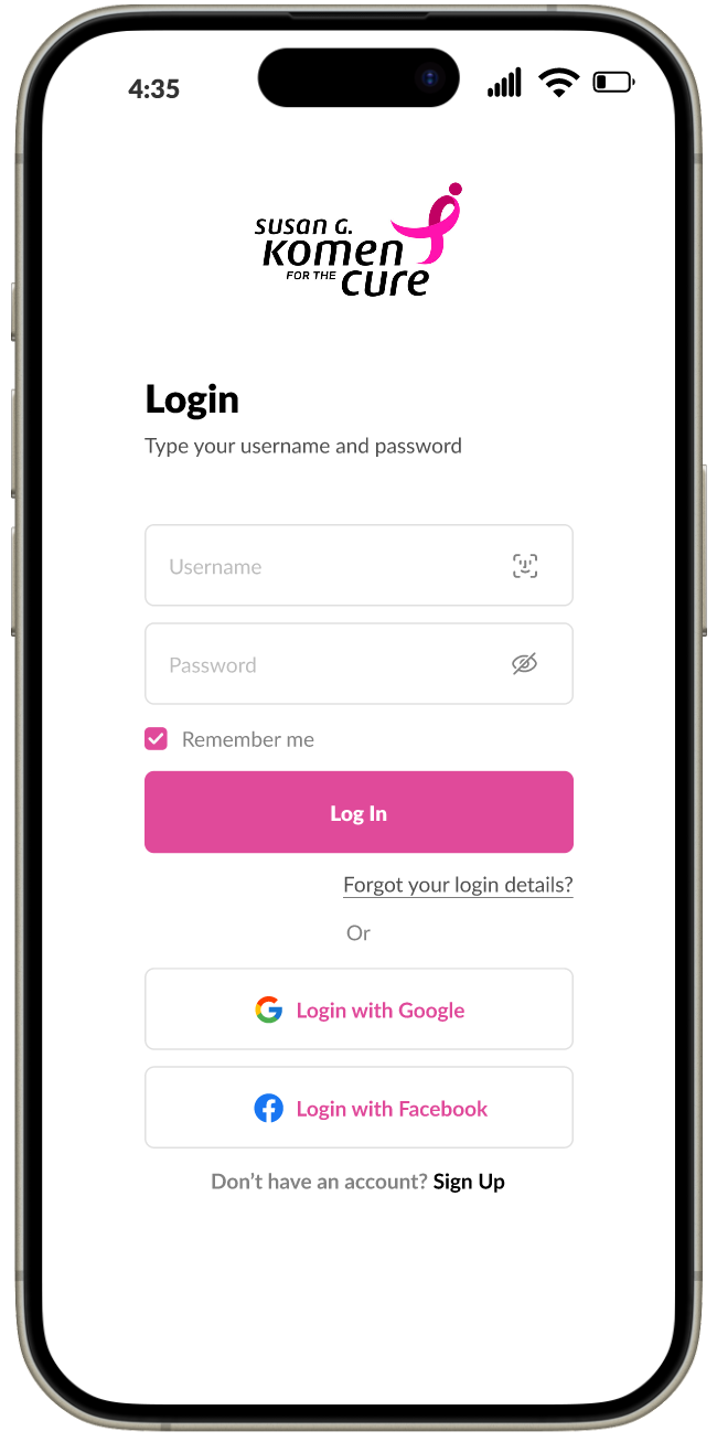
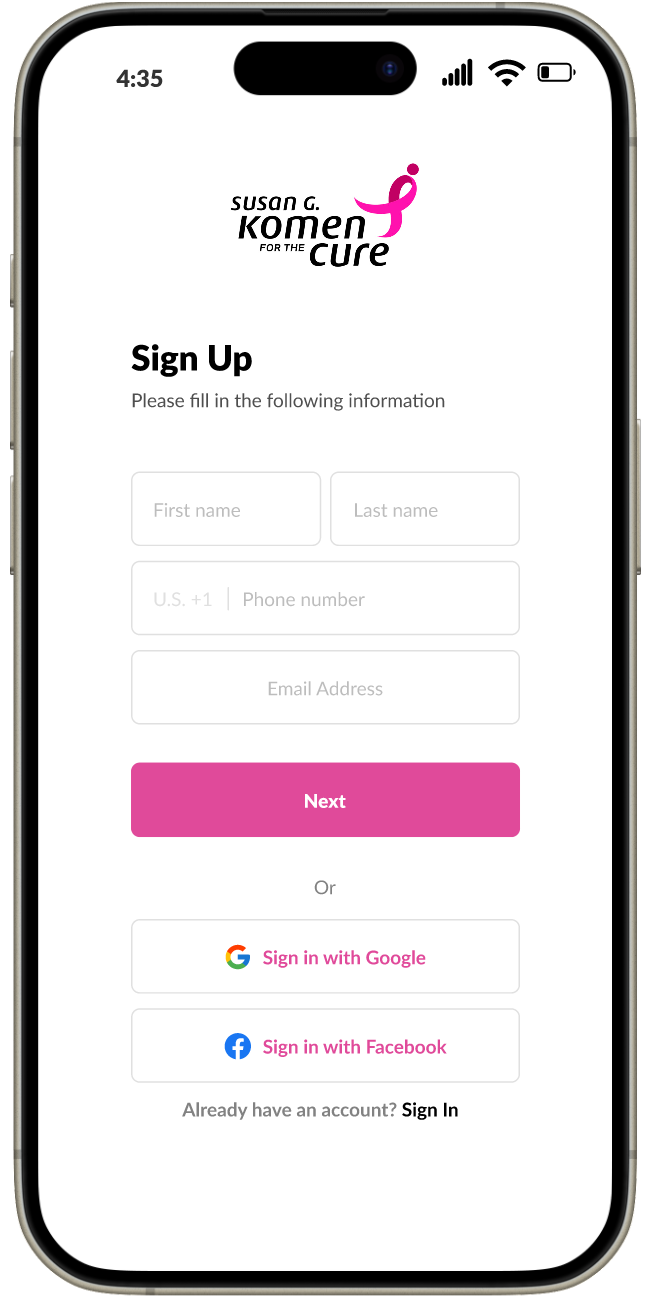
For the login process, I enhanced the sign-up feature to streamline new user registration. Now, users can simply enter basic details such as their name, phone number, email address, and password to create an account. Additionally, to accommodate different user preferences, I implemented an alternative sign-in option using social media accounts, which simplifies the registration journey. Recognizing the challenges that some older users may face with social media or email authentication, I also introduced a feature that enables login with Face ID, offering a convenient and secure alternative.
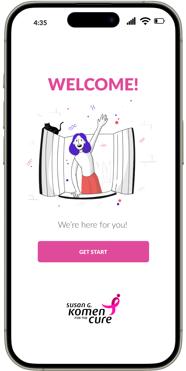
Enhancing User Onboarding
Event Page Design
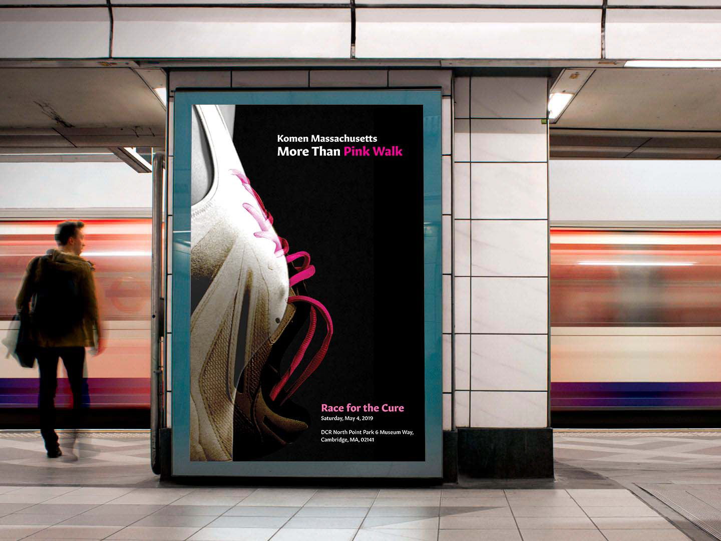
One of the standout features of the redesigned app is the 'Events' section. I have crafted this interface to enable users to effortlessly browse through events, organized by their upcoming dates. Users can interactively swipe through poster cards to discover events they're interested in participating in, making it an effective tool for the organization to showcase and promote its activities. This interface also incorporates a prototype of a poster I designed, which visually merges the concept of the "Race for the Cure" with the symbolic representation of the fight against breast cancer.
Optimized User's Account
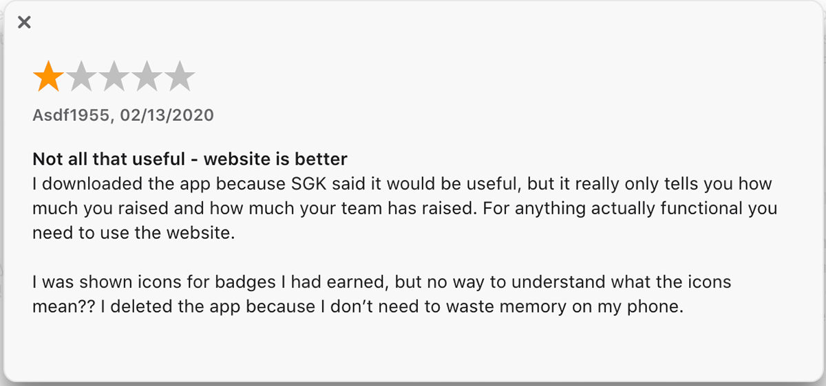
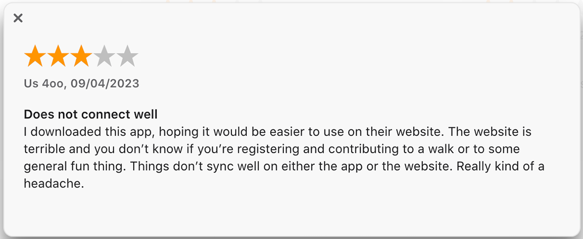
To address feedback indicating that the app lacked features available on the website, I conducted a thorough review of the website's offerings. I discovered valuable functionalities such as 'My Health' and 'My Donations' that were missing from the app. Acknowledging the appeal of gamification, I maintained the 'My Badges' feature but repositioned it to a less prominent area of the user interface. This strategic decision places greater emphasis on essential features like 'My Health,' 'My Donations,' and 'My Fundraising,' which are of utmost importance to our users. By reordering these elements, the app now aligns more closely with user priorities and the practical needs of the breast cancer community.
